How to Create Simple Graphs Using Matplotlib
A comprehensive guide with code explanations on creating simple graphs using Matplotlib.
Matplotlib is the most common library to be used for graphs, it is relatively easy and has many options and kinds of graphs.
Line graph:
A line graph has two axes, the horizontal and the vertical axis, each value on the horizontal axis corresponds to a value in the vertical, a typical example of a line chart is a value changing per day.
Now we have to create the data for the axes, we will call the horizontal axis x and the vertical y.import random
x = list(range(0,10))
y = []for i in list(range(0,10)):
y.append(random.randint(1, 100))
Code explanation:
The following line will create a list of integer numbers from 0 to 9.
x = list(range(0,10)This line will create a list with 10 elements with random integers from 1 to 100.y.append(random.randint(1, 100))
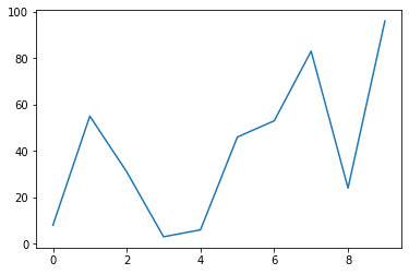
Now we have some data to plot, enter the following codeimport matplotlib.pyplot as plt
plt.plot(x,y)
plt.show()
- The first line instructs Python to load Matplotlib.
- The second line
plt.plot(x,y)instructs python to create a line plotplot(x,y)and usexas horizontal axis values andyas vertical. - The third line
plt.showdraws the graph on the screen, you should get something like the bellow image but note that this probably differs in your case since we generate random values for the vertical axis.
Scatter plot:
A scatter plot uses dots to represent each pair of the axes values. Assuming using the previous values run the following code:import matplotlib.pyplot as plt
plt.scatter(x,y)
plt.show()
- The only thing that changed is the second line,
plt.scatter(x,y)which instructs Python to draw a scatter graph.
Bellow is the generated graph:

Histogram:
A histogram is a diagram in which the vertical axis is the frequency of each variable of the horizontal axis.
Enter the following code:import matplotlib.pyplot as plt
x = [1,1,1,2,2,2,3,3,3,4,4,4,5,5,5]
plt.hist(x)
plt.show()
plt.hist(x)instructs python to plot a histogram with values ofx.
The following is the produced diagram:

We can notice that each of our values in the horizontal axis has a value of “3”, this is because the occurrence of the values is actually “3” if we examine the values of the list x .
Histograms can have bins, bins are a way to group data based on variables of the horizontal axis, let's consider the following example:import matplotlib.pyplot as plt
import random
x = []
ages = [0,5,10,15,20,25,30,35,40,45,50,55,60,65,70,75,80,85,90,95,100,105,110]
for i in list(range(0,10)):
x.append(random.randint(0, 10))
print(x)
plt.hist(x,edgecolor="red",bins=ages)
plt.show()
Running this in my computer-generated the following x list:[8, 1, 3, 2, 4, 10, 5, 5, 5, 8]
And the following histogram:
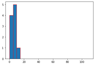
- We can see that the horizontal axis has values of list
agesbut with vertical values only between 0 and 10, this is because we have asked python to generate 10 numbers between 0 and 10 - We can see that we have 4 occurrences of numbers between 1 and 4 and this is grouped in one bin [0,5]
- We can see that we have 5 occurrences of numbers between 5 and 9
- One occurrence of numbers between 10 and 14
Graph labeling:
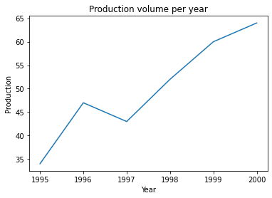
To make a graph even more readable and useful we need to label the horizontal and the vertical axis and add a graph title with a good description of our graphimport matplotlib.pyplot as plt
year = [1995,1996,1997,1998,1999,2000]
prod = [34,47,43,52,60,64]
plt.plot(year, prod)
plt.xlabel('Year')
plt.ylabel('Production')
plt.title('Production volume per year')
plt.show()
plt.xlabel('year'): horizontal axis label set to “year”plt.ylabel('Production'): vertical axis label set to “production”plt.title('Production volume per year'): graph title set to “production volume per year”
This will generate the following graph
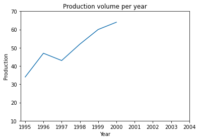
But what happens if we want to have in our graph axes labels that are not part of the year or prod lists, for example, we might want to show labels after 2000 and production labels less than 35 despite that there are no values:import matplotlib.pyplot as plt
year = [1995,1996,1997,1998,1999,2000]
prod = [34,47,43,52,60,64]
plt.plot(year, prod)
plt.xlabel('Year')
plt.ylabel('Production')
plt.yticks([10,20,30,40,50,60,70])
plt.xticks(year+[2001,2002,2003,2004])
plt.title('Production volume per year')
plt.show()
plt.yticksvertical axis labelsplt.xtickshorizontal axis labels
This will generate the following graph:
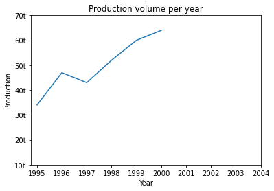
What if we asked to add measurement units in our vertical axis? The units in vertical axis are tones “t”.import matplotlib.pyplot as plt
year = [1995,1996,1997,1998,1999,2000]
prod = [34,47,43,52,60,64]
plt.plot(year, prod)
plt.xlabel('Year')
plt.ylabel('Production')
yl = [10,20,30,40,50,60,70]
ylu = [str(x)+"t" for x in yl]
plt.yticks(yl,ylu)
plt.xticks(year+[2001,2002,2003,2004])
plt.title('Production volume per year')
plt.show()
ylis the list of vertical axis valuesyluis generated by converting each element ofyland appending the character “t”plt.yticksnow accepts two lists, the first is the labels and the second are the labels with the units we have generated.
This is the generated graph:
I hope you find my article useful and help you begin working with Matplotlib.
More content at PlainEnglish.io. Sign up for our free weekly newsletter. Follow us on Twitter and LinkedIn. Join our community Discord.
